



In New York City, a business website often serves people who are checking hours between subway stops, comparing services during a lunch break, or making a decision from a phone on a crowded sidewalk. A well-planned site respects that limited attention by loading quickly, explaining essentials clearly, and making key actions easy to complete. Working with a WordPress development company in New York can help organizations translate those goals into a practical site structure.
Whether the business is a Brooklyn restaurant, a Queens contractor, a Manhattan professional practice, or a Staten Island retailer, the same principle applies: visitors should be able to find what they need without fighting slow pages, unclear menus, or difficult forms.
1. Why Speed And Accessibility Matter
A visitor may leave when a page feels slow, especially when they only need a phone number, menu, appointment option, or store location. Performance is therefore a customer-service issue, not merely a technical score. Accessibility matters for the same reason: everyone should have a workable path to information and services, including people who use screen readers, keyboards, captions, zoom controls, or other assistive technology.
New York City adopted WCAG 2.2 Level AA as its standard for city digital content in December 2025, and the city’s digital accessibility guidance offers a useful reference point for organizations seeking to build more inclusive online experiences. Accessible choices also help people using a phone in bright sun, navigating with one hand, or reading content in a noisy environment.
2. Start With User Needs
Strong website development begins with the tasks visitors need to finish, not with colors or animations. Identify the primary audiences, their common questions, and the actions that matter most. Ask who visits, what they seek, whether they are likely to arrive on a phone, and whether language options would make the site easier to use.
A neighborhood clinic, for example, may need to put its hours, transit details, appointment instructions, insurance information, and contact options near the top of the site. Those details are more useful than a large visual banner that pushes essential information down the page.
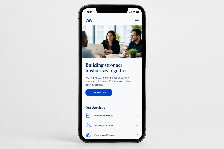
3. Improve Mobile Performance
Mobile performance improves when teams make deliberate choices about page weight and behavior. Compress oversized images before uploading them, use modern image formats where supported, and remove scripts, plugins, fonts, and animations that do not serve a clear purpose. Videos should load only when a visitor chooses to play them.
Set image dimensions to reduce unexpected layout movement, use caching where appropriate, and consider a content delivery network for sites serving visitors across the city and beyond. Test on an ordinary mobile connection, not just a fast office network. A simple page that lets someone call, book, or request a quote quickly can be more effective than a visually busy page full of delays.
4. Build For Accessibility
Accessibility is a design and development practice, not a final checklist. Use headings in a logical order, provide useful alternative text for meaningful images, and make menus, buttons, and forms operable with a keyboard. Every form field should have a clear label, and error messages should explain what needs attention.
- Use readable text with sufficient contrast against its background.
- Do not rely on color alone to communicate status or instructions.
- Add captions or transcripts for important video and audio content.
- Allow text to zoom and reflow without hiding important content.
- Test automated findings manually, since a scanner cannot confirm that a task is understandable.
5. Create Clear Navigation
Visitors should not have to guess where pricing, services, locations, policies, or support information belongs. Keep the main menu focused, use familiar labels, and make contact details consistent throughout the site. Larger sites can benefit from a visible search tool, while smaller sites may only need a concise menu and prominent calls to action.
Specific links are more helpful than vague labels. “View Catering Menus” conveys far more to a customer than “Learn More,” while “Schedule A Consultation” makes the next step clear for a prospective client.
6. Write Useful Website Content
Helpful content answers practical questions before it tries to sell. Use descriptive page titles, short paragraphs, plain language, and headings that let people scan. Keep hours, addresses, prices, availability, and policies up to date. Local details can be especially valuable when explaining delivery areas, borough-specific service coverage, transit access, or in-person pickup options.
Review older pages for expired offers, broken links, duplicate copy, and missing contact information. Each call to action should match the page’s purpose, whether that is ordering, booking, calling, visiting, or requesting an estimate.
7. Test Before Launch
A launch review should cover more than appearance. Test the site on current phones, tablets, and desktop screens. Complete important visitor tasks from beginning to end, including form submissions and confirmation emails. Check links, redirects, search tools, pop-ups, menus, images, and videos.
Navigate key pages with only a keyboard and test performance on a slower connection. Finally, ask someone who did not help build the site to find information or complete a common task. Fresh eyes often uncover confusing labels and overlooked steps.
8. Maintain The Site After Launch
A website needs ongoing attention after publication. Schedule reviews for business details, forms, purchase paths, broken links, missing images, platform updates, backups, and speed checks. Repeat accessibility testing after major design or content changes. The accessibility standards used in New York City’s digital design system can also help teams evaluate components such as links, error messages, inputs, and navigation patterns.
9. Common Questions
How Fast Should A Business Website Load?
There is no single target that fits every page or audience. Focus on whether real visitors can see useful content and complete important tasks without unnecessary waiting.
Does Accessibility Apply Only To Large Organizations?
No. Accessible design can make content, forms, and navigation clearer for customers of any business size.
Should A Business Rebuild Its Entire Website?
Not always. Better images, clearer navigation, improved forms, and updated content can solve meaningful problems without a full rebuild.
How Often Should A Website Be Tested?
Test during development, before launch, after significant updates, and whenever users report a problem.
Conclusion
In a city as fast-moving as New York, a business website should make life easier, not add another obstacle. Every second saved, confusing step removed, and accessibility barrier addressed brings visitors closer to finding what they need and choosing to take action. By prioritizing mobile performance, intuitive navigation, useful content, and ongoing improvements, businesses can create digital experiences that work for more people and inspire lasting confidence. The strongest websites do more than keep up with New York; they make every visit count.