




Understanding Grid Layouts in Web Design
Grid layouts are foundational for building visually consistent and organized websites. Offering a systematic way to arrange content, grids divide a page into rows and columns, establishing order and a clear visual hierarchy. This design principle helps users scan, understand, and interact with content seamlessly, ultimately boosting engagement and usability. With the increasing need to deliver experiences across devices, a robust grid system can make or break the effectiveness of modern web design. Designers often turn to resources like grid UI collections for inspiration and to stay up to date with the latest visual strategies.
A grid’s strength lies in its adaptability. By promoting consistent spacing and alignment, it brings structure to everything from minimalist layouts to complex portfolios. The underlying organization also ensures that sites are visually appealing, guiding users through content in a thoughtful, intuitive sequence that facilitates retention and interaction.
Over the past decade, grid layouts have evolved significantly. As user expectations for seamless digital experiences have grown, designers have embraced new techniques, including more dynamic and flexible grid approaches, to ensure sites look and perform their best on any screen size.
These evolutions reflect the web’s broader shift from rigid uniformity to more expressive, user-centric layouts. Industry leaders such as Smashing Magazine routinely highlight the importance of grid systems in crafting modern web applications that deliver both function and flair.
Embracing Asymmetrical Grids
Symmetrical grid systems once shaped the look of early web designs, offering straightforward, balanced layouts. However, the latest trend favors asymmetrical grids, which break away from predictable patterns to inject energy and movement. By playing with cell sizes and deliberate visual imbalance, designers create a dynamic path for the user’s eyes, enhancing engagement and perceived innovation.
Asymmetrical grids aren’t about abandoning order entirely, but about reimagining how order is expressed. These layouts cater to modern audiences by mixing sizes, shapes, and positions, drawing attention to key content and making a site stand out. Studio blur effects can complement this approach by adding subtle depth and visual separation to selected elements without overwhelming the overall composition. Industry voices note that layouts that employ asymmetry often hold attention longer and convert more effectively, especially on creative and portfolio-style sites.
Incorporating Organic Shapes and Anti-Grid Designs
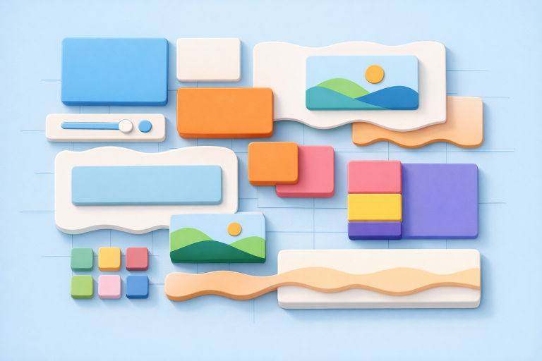
Not all innovation in layout comes from grids. Many designers are moving beyond grids entirely, drawing inspiration from organic shapes and anti-grid structures. This trend introduces fluid curves, waves, and irregular forms, offering a softer, more approachable digital experience. Such layouts can evoke emotion and establish brand identity while still providing a logical flow for information.
The anti-grid approach is particularly effective for brands that wish to communicate uniqueness and originality. Organic layouts often guide users’ attention in unexpected ways, creating memorable digital experiences and increasing dwell time. This design philosophy continues to gain traction among creative agencies and lifestyle brands looking for a fresh edge.
Leveraging CSS Grid and Flexbox
The rise of CSS Grid and Flexbox has transformed layout possibilities for web designers. CSS Grid enables two-dimensional layouts, offering granular control over rows and columns and supporting a wide range of creative designs. Flexbox, on the other hand, is tailored for one-dimensional layouts, simplifying alignment and distribution in a single row or column. Together, these tools ensure layouts are highly customizable and performant across all devices.
With their responsive nature, CSS Grid and Flexbox help designers meet user expectations for seamless browsing experiences from desktops to smartphones. Mastery of these technologies is essential for any designer looking to implement modern, scalable layouts efficiently. Resources such as Smashing Magazine offer in-depth guides for both beginners and advanced developers.
Best Practices for Implementing Grid Layouts
Effective grid design isn’t just about choosing the right technology. Following these best practices ensures consistency and user-friendliness:
- Understand Grid Anatomy: Thoroughly learn key components such as columns, rows, gutters, and margins for precise layout control.
- Choose the Right Grid Layout: Tailor your grid system to fit the project’s content structure and design objectives.
- Honor Responsive Design: Ensure grids adapt across a wide range of devices for optimal usability.
- Make Room for White Space: Intentionally space elements to improve readability and focus.
- Respect the Golden Ratio: Use mathematical proportions to create visually pleasing layouts.
- Obey the Rule of Thirds: Leverage the principles of division to balance visual content naturally.
Applying these principles helps designers balance visual appeal with accessibility, leading users smoothly through content with minimal friction.
Exploring Bento Grid Layouts
Inspired by the tidiness of Japanese bento boxes, Bento grid layouts are a standout trend for creative professionals. This approach uses a mix of card sizes to organize and present a range of content types, such as images, text, and interactive elements, within a visually coherent, easily scannable interface. Bento grids deliver a clear hierarchy while maintaining a playful, engaging structure, perfect for portfolios or agency websites.
By varying the size and shape of content blocks, Bento grids accommodate a wider range of content without overwhelming users. They enable quick content discovery while giving designers the freedom to highlight key features and craft distinct visual experiences.
Utilizing Grid Tools for Efficient Design
To meet the demand for responsive and balanced web layouts, a range of grid tools is now available. These tools provide designers with predefined systems, customizable templates, and real-time previews, all of which speed up the iteration process and help teams discover the ideal structure for any project. From beginner-friendly builders to advanced plugins for professional software, today’s grid tools streamline design, development, and collaboration.
Designers with an understanding of grid fundamentals and access to quality tools are best positioned to adapt quickly to shifting trends and deliver exceptional user experiences.
Conclusion
Grid layouts remain a cornerstone of user-centric web design. They provide the scaffolding for accessible, interactive, and visually compelling digital experiences. By embracing emerging trends like asymmetrical and bento layouts, exploring organic design approaches, and mastering CSS Grid and Flexbox, designers can create websites that are both functional and memorable. Staying up to date with the latest techniques ensures lasting relevance in a rapidly evolving digital landscape.